top of page
goodreads iOS mobile app redesign
improving navigation, social features, and visual interface of Goodreads, a book cataloging platform that has been used by 90 million users per year.

role:
project type:
duration:
deliverables:
ui/ux design, ux research
individual, personal project
1 month (dec. 2021 - jan. 2022)
high-fidelity prototype
background
Goodreads is a book cataloging app with over 90 million registered readers. Using Goodreads, users can log their yearly reads, review books, create virtual bookshelves, and connect with fellow readers. Although the iOS app is rated an average of 4.8 out of 5 stars on the App Store, Goodreads users in book communities across social media platforms (primarily Twitter, Tumblr, and Instagram) have continuously voiced their dissatisfaction for the app. This caught my attention and motivated me to dig into the root of users’ dissatisfaction and redesign the app to fit their needs.
online research
I began the research process by looking into users’ reviews on the App Store for pain points.

The reviews seemed to bring up recurring problems, which I identified to be:
-
Outdated user interface
-
Lack of social aspect
-
Hard to navigate
-
Lack of personalized features for users compared to similar apps (such as stats, half-stars, etc.)
Some other complaints also mentioned the disparity between the amount of features available on the desktop site versus the iOS app and that technical bugs take away from a satisfying experience.
user research
Next, I conducted user research by obtaining results from an online survey as well interviewing Goodreads users through virtual calls and messaging. The survey was intended to collect data about the users’ habits both for reading and for using the Goodreads iOS app, and the interviews gave a more in-depth grasp on what users’ exact pain points and needs are.
Key findings from the online survey (results consisted of a sample of 50 users) and the interviews:
-
Most users find the app too cluttered and the interface to be unappealing.
-
Navigation and finding where targeted features are is difficult due to the amount of steps in the flow to get to that feature.
-
Most readers are drawn to a book because of an interesting synopsis, with runner-ups being the genre of the book and if their friends liked the book.
-
The rating system is too strict; users would appreciate the ability to give half-star ratings.
-
Commenting and interacting in the social sphere of Goodreads is exhausting because of how limited and undiscoverable the features are.
defining the problem
pain points


wants & needs


user personas
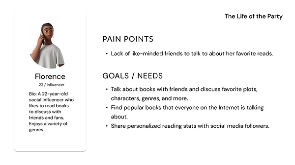
Four personas were then created based on a combination of the survey results and the interviewees. To make sure that a variety of users are accommodated for, these personas characterize a few different types of users, each with different personalities, needs, and wants.


low-fidelity prototypes
Next, I created low/mid-fidelity wireframes in preparation for the final prototype:

results
Next, I created low/mid-fidelity wireframes in preparation for the final prototype:
This is the current iPhone 11 prototype of my Goodreads redesign.
home

-
Currently Reading section added to the top of Home Screen.
-
For Adam (The Busy Reader), this provides a quick way to update progress when in a time crunch.
-
-
Added a three-dot "More Options" icon next to each post in feed if the user wants to report content or hide content.
discover

-
Personalized content such as "Weekly Picks for You", "Favorite Genres", and an expanded "Because You Enjoyed..." section (all generated from user's past activity) helps June (The Organized Bookworm) easily find new reads tailored to her taste.
-
This also gives a way for Adam (The Busy Reader) to find books he loves quickly.
-
-
"Popular Groups" section allows users like Florence (Life of the Party) to connect with like-minded readers.
notifications / friend requests

-
Users can now see other users' responses for the optional question some users set for requests, a feature currently only available on the web version of Goodreads.
-
This can aid Florence (The Life of the Party) to filter through those who want to add her as a friend.
-
-
Removed "Messages" tab since messages are now accessible through the button at the top right of most pages.
profile


-
Separated information into "About", "Activity", and "Stats" (user's reading stats).
-
Expanded "Bookshelves" section into default bookshelves and custom bookshelves.
-
Showing "Favorite Tags", "Favorite Genres", and "Stats" sections to encourage more user interaction due to similar interests.
-
"Stats" tab includes a user's favorite books, authors, genres, tags, and their average rating. This info can be made private in Settings.
-
This is useful for Florence (The Life of the Party), who is constantly looking for fellow readers to connect with.
-
book details


-
Showing a book's tags to give users a sneak peek of content and categorizations.
-
Good for Adam (The Busy Reader) who may need high-level, brief genre overviews of books, such as the book's tags, to gauge his interest.
-
-
Half-star ratings are now an option for better customizability on reviews.
-
Handy for users like Florence (The Life of the Party) who want to share personalized stats (including reviews) with friends.
-
Practical for June (The Organized Bookworm) to get more accurate recommendations with a more precise review scale.
-
-
Separated "Update" (Progress) button from "Currently Reading" button to avoid confusion about where to update progress.
-
User's activity on book moved to distinct "Activity" tab to avoid clutter and to emphasize the synopsis, which many readers consider when choosing books to read.
-
Displaying separate averages for friends' reviews and community reviews.
-
All three user personas can now get a better sense of if they'd like the book, either for themselves, at a glance, or based on friends' opinions!
-
groups


-
Information divided into "About", "Rules", & "Members" tabs to avoid clutter.
-
"Currently Reading" section can be optionally enabled by moderators to show picks for book clubs.
-
Individual threads formatted more like a comments section / chatroom to inspire more friendly chatting than current "posts" format.
-
Reorganized "Groups" with comments format lets users like Florence (The Life of the Party) find reading buddies more easily.
-
comments

-
Users now have the ability to reply and like comments under posts.
-
This helps Florence (The Life of the Party) to interact and discuss with friends more, and provides June (The Organized Bookworm) a way to clarify about reviews and comments to understand if she is interested in a book.
-
menu

-
Menu moved to top left corner (can be accessed by click or swipe right) for easier navigation and to allow for more commonly used features to be located in navbar (ie. profile page). This takes advantage of the user's possible preexisting mental model of similar UI patterns in other platforms such as Twitter.
This redesign addresses all 4 of the pain points and needs defined earlier:
-
A cleaner interface has now replaced the outdated one, featuring a consistent color palette, accessible fonts, and less clutter.
-
Ease of navigation has been improved by placing commonly visited pages such as the Profile page in visible areas (like the navbar) and by providing better signifiers. Organization of information on pages like the Groups page has also been made clearer.
-
Users have more customizability by being able to rate books by half-star increments, seeing their stats in the “Stats” tab on their profile, and having more personalized features like "Favorite Genre" and "Favorite Tags."
-
Comments are now able to be replied to and conversations in the Group feature resemble comments / a chatroom rather than more formal-feeling posts. This gives more socializing capabilities and encourages interactions between users.
reflection
the story
This was my very first UX design personal project, which I started not long after I completed the IBM Accelerate Program Design Track. It was in June of 2021 that I conducted my first set of interviews for this project; I got feedback from a mentor at IBM, analyzed the results, and then the project was paused when my focus shifted to transferring universities.
When I decided to pick the project back up again, I had trained under Sony and gained experience in the design process. I was surprised and thrilled to reflect back on my growth, and still am, now closer to the end of the project.
learnings & challenges
The master-apprentice model is key. When I first started the project, I was tempted to insert my own assumptions and thus create a cycle of confirmation bias when researching. Learning to let go of those assumptions has been one of my biggest challenges in UX design, but using the master-apprentice model during interviews opened my eyes up to valuable info that may have been lost if assumptions had gotten in the way. UX is for the user and guided by the user, after all, and understanding this will allow me to better put user research data to use in future projects.
what's next?
-
Usability testing. I'm currently in the process of usability testing these final prototypes; please look out for that data to be added soon!
-
Implement the existing Goodreads design system. One of the most important aspects of a redesign is adopting the product's existing design system, and I'm seeking to further incorporate that into my redesign.
-
Competitive analysis. Reiterate and apply data gathered from conducting a competitive analysis with similar platforms such as Storygraph and Readerly. More features. Settings for buddy reads, showing how the messaging page would look, etc.
-
Add more features. Interviewees have suggested other features such as a buddy read system which may be worth exploring.
thank you for viewing this case study! ☻
interested in seeing more of my work? explore below:


bottom of page