top of page
Civic Tech Jobs
How might we create a more efficient and cohesive volunteer onboarding process for 4000+ team leads, project managers, and volunteers?

PROTOTYPES
role:
project type:
duration:
deliverables:
ui/ux design
team (1-3 others & me), nonprofit work
11 months (aug. 2021 - jun. 2022)
high-fidelity prototype / minimum viable product (MVP)
BACKGROUND
Hack for LA: A crisis in the pandemic

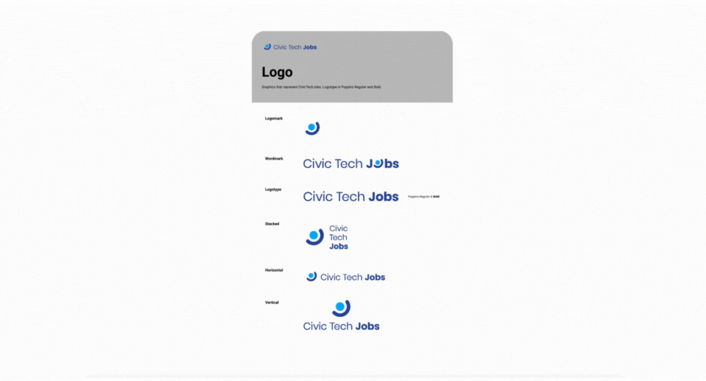
I joined the project in its earliest stages, when all it had was a logo and a color scheme, and am now working cross-functionally to build the minimum viable product (MVP) for Civic Tech Jobs’ first launch.
-
Inability to control who enters the organization, leading to spam / overwhelming amounts of messages.
-
Project managers are unable to complete milestones with the constant onboarding and dropoff of volunteers.
-
Newly onboarded volunteers often do not have clear expectations for what to expect from onboarding, nor a solid understanding of their next steps, resulting in a mismatch between projects and their volunteers’ goals.

The current volunteer onboarding user flow leads to poor communication and high drop-off rates.
DEFINING THE PROBLEM
Overflows and user flows
Before I joined the project, brief interviews with project managers, a competitive analysis of other volunteer organization websites, and early-stage usability tests were already conducted. From this research, the following pain points were identified:
Defining the problem
AND SO WE ASK...
How might we create a more intuitive and efficient volunteer onboarding process for 4000+ project managers and new volunteers in order to match interests more accurately and reduce dropoff rates?
How might we
IDEATION
Wireframes for brainstorming
My team and I began by ideating our initial landing page ideas. One of my designs was then selected to be developed further after being presented to the rest of the Civic Tech Jobs team due to its use of more organic shapes such as circles and the clean, uncluttered layout.


RESULTS
High-fidelity prototypes
Clear onboarding instructions
Civic Tech Jobs' home page and How to Join page use clear language to give an overview about the onboarding process, minimizing confusion about next steps.
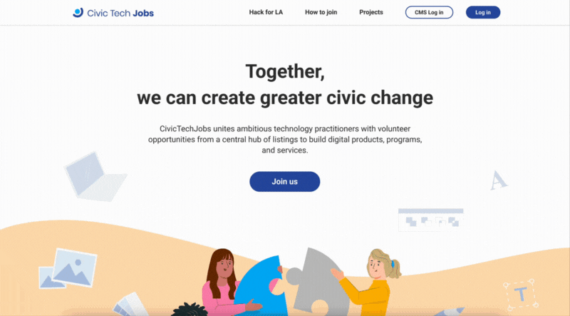
Filtered results for the best match
Users are prompted to choose their area of interest and fill in their availability to ensure a match between the users' goals and their recommended roles and prevent future dropoffs due to lack of interest.


Sign up to verify onboarding
To join Hack for LA, all volunteers must attend a virtual onboarding meeting. When users sign up, they receive a verification email with onboarding meeting details, and any previous search activity is saved. They become registered as a verified user in the CTJ database.


Log in for full role postings
To see the full role descriptions without blurred info, users must log in to their existing account. This makes sure that people who join the Slack after onboarding are verified users, preventing overwhelming amounts of spam messages in project managers' inboxes.
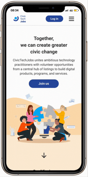
Mobile version coming soon
High fidelity prototypes
Design system
We are in the process of revamping our design system to include more details, such as CSS specifications.
Usability testing
USABILITY TESTING
Did CTJ improve the volunteer onboarding process?
The user research team and UX design team worked together to usability test the current flow. I then collaborated with both teams to affinity map the different pains and gains as reported by users. Overall, we found that the process became more intuitive and clear, but specific steps were still in need of more clarification.


The research team, design team, and I proceeded to categorize the pain points brought up by urgency level and effort level, as seen below. The "Recommendations" column is a result of a fellow designer and I rapidly ideating possible solutions to each pain point.


Categorization scale for urgency level and effort level.
For full tables, click here.
NEXT STEPS
After all this...
I am currently taking a break from this project to focus on my internship with UCSD Design Lab. If I were to return to the project, I would:
-
Continue my work on the Content Management System (CMS) dashboard, where team leads and product managers can post open roles and keep track of their postings, and the search results page.
-
Help research team conduct usability tests on our MVP prototypes and are sending out surveys to further understand our target audience.
-
Continue iteration on pages based on research findings to better support users. For example, we previously made the availability block color green to signify that users fill in when they're available, not unavailable (this was a common misconception).
The engineering team is currently developing my work into a live website.
KEY TAKEAWAYS
The project that taught me design
-
Larger scope = more challenges = more growth. I'm not kidding when I say this project taught me design. Civic Tech Jobs is my largest project to date. Not only did I learn how to use common design tools like Figma and accessibility guidelines like WCAG, but I also was introduced to design systems, which helped me understand how to best bridge the hand-off between designers and developers.
-
Failure mapping is helpful. My team and I approached this project by examining the current user flow and researching all the different points users could struggle with. Being able to map out the user's pains and needs at each step in the flow helped me gain a big-picture view of the project and understand the narrative beyond individual screens.
Key Takeaways
Thank you for viewing this case study! ☻
Interested in seeing more of my work? Explore below:


bottom of page